Form follows function
But this principle doesn’t just apply to architecture — it’s equally valid in technical and product design.
At its core, form follows function means that the shape, structure, and layout of a device should be primarily determined by what it’s meant to do. A well-designed tool puts functionality first — ensuring that it’s intuitive, efficient, and effective. Aesthetics can enhance the experience, but they should never compromise usability.
That said… don’t worry. I won’t ignore how it looks — a bit of style never hurts, even when it’s all about performance.
The following sections shows the general design decisions and why
Standard devices
As mentioned in the introductionary text, most devices still rely on small LCD character displays. This often forces users to dig through endless menus and decipher cryptic abbreviations — an experience that feels more like solving puzzles than making music.
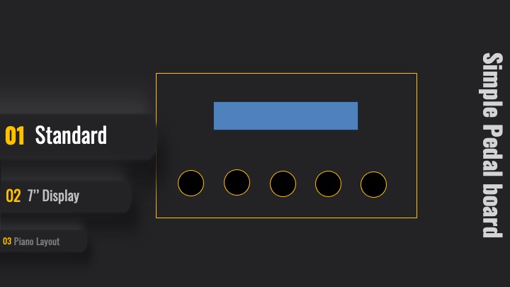
Sure, LCDs may seem a bit outdated, but they still have their use.
If you’ve ever played an outdoor gig in bright sunlight, or an indoor show under badly placed stage lights, you know the pain: you’re effectively blind. Reflections on glossy screens or overly bright color schemes can make it nearly impossible to tell whether an LED is on or off. You end up guessing — sometimes completely wrong — about what state your instrument is in.
This isn’t just inconvenient, it’s stressful. And that’s the kind of design flaw I want to avoid from the start.
Display 7" touch screen
Hopefully, a 7-inch touchscreen will make life a little easier.
A responsive touchscreen combined with a clean, well-designed UI should simplify both setup and everyday use. But we need to keep one important thing in mind: during live performances, clarity is king. Musicians don’t have time to dig through submenus or second-guess what a button might do.
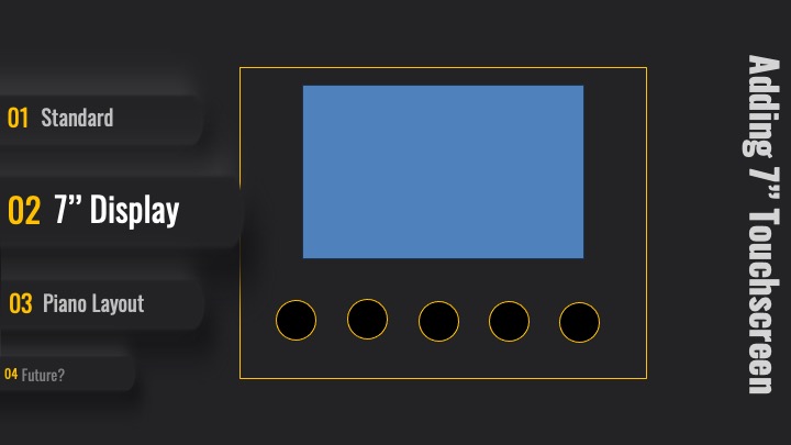
On stage, it’s essential to have a quick and clear overview of every control and function. Even something like tempo visualization might be a huge help — especially when kicking off songs like Journey’s “Separate Ways” or Queen’s “One Vision”. Start too slow, and the song loses its groove. Start too fast, and the singer either loses breath… or their will to live.
Two Interfaces, Two Purposes While the performance UI needs to be simple, bold, and crystal clear, we also need a completely separate programming interface — a space where you can:
- Configure MIDI routings
- Manage connected MIDI devices
- Diagnose and track down connection issues
- Build and edit Setlists
- Assign actions to buttons and triggers
And all the other behind-the-scenes magic that makes the performance possible.
One screen to rule the stage. One screen to rule the backend.
Piano Layout
The limited features of cheap pedal boards - firing just program changes, or arbitrary control messages - may sometimes fit, though. But:
We’re about to go where no pedal board has gone before!
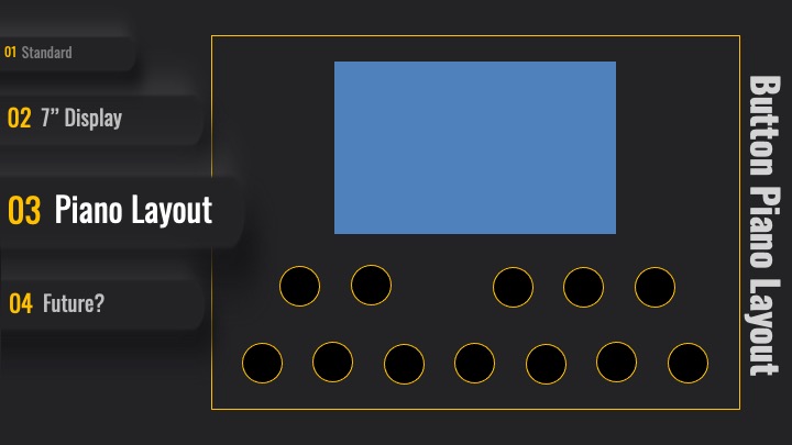
I want to play notes and chords directly from the board — not just trigger events. And once you start doing that, traditional grid-style button layouts quickly fall apart. They’re not built for musical memory — they’re built for symmetry and compactness.
Even as a hobby musician, I’ve found that I can far more easily recall note and chord positions when the buttons are arranged like a piano keyboard. It’s just more natural. You think in octaves, not XY coordinates. So instead of fighting muscle memory, I decided to embrace it — and design a layout that’s actually made for music.
And why not adding sample playback capabilities? Or SFZ? Why should I limit the board to plain MIDI messaging?
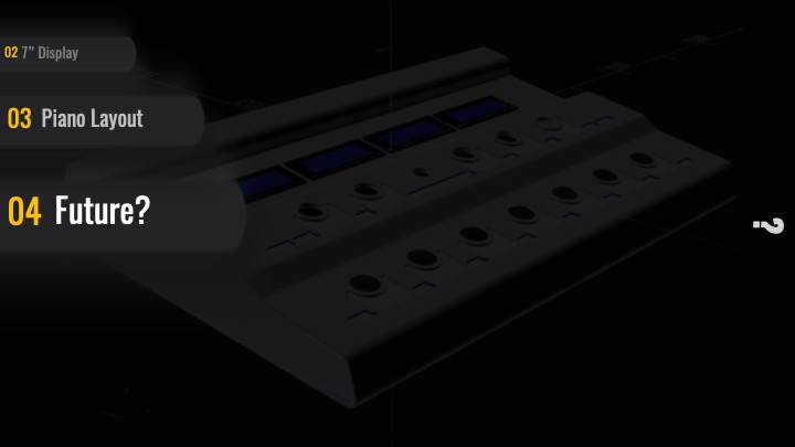
Past or Future?
The following image is a 5-year-old 3D rendering created in OpenSCAD. It represents an early design concept and does not include the touchscreen, so you can expect the final board to look quite different.
Think of it as a glimpse into the past — before touchscreens, before WiFi, before I knew I’d need a second power supply just for my ambition.
Now we know how it looks like - theoretically, time to scratch hardware.